Chicken Boom

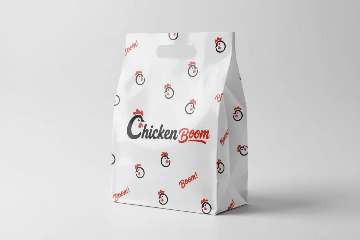
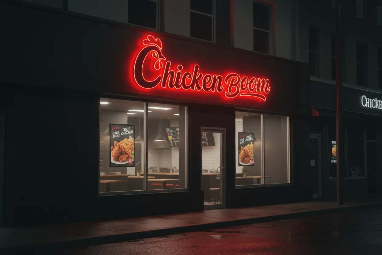
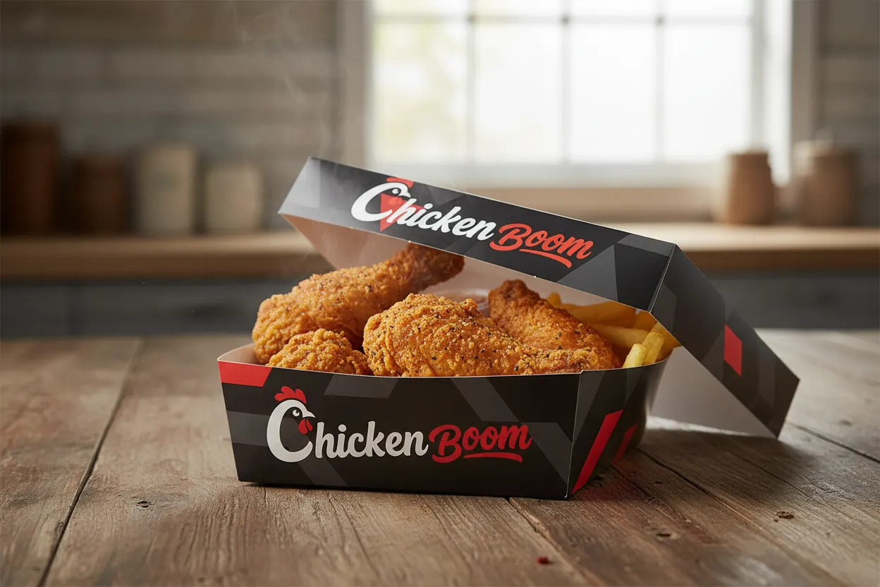
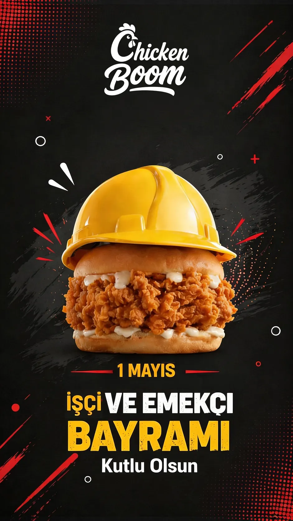
The “Chicken Boom” logo is designed in a modern and eye-catching style that reflects the lively nature of the snack restaurant. The logo combines a simple, recognizable chicken illustration with the text, making the brand instantly identifiable. The word “Chicken” in black conveys clarity and professionalism, while the bold, curved typography of “Boom” in red adds a dynamic and playful touch, reflecting the energy and vibrancy associated with the restaurant.

My Role
Tools

Design Analysis:

  1. Colors:
    • Black: Conveys professionalism and readability.
    • Red: Represents energy, excitement, and draws attention, suitable for a fast-food/snack restaurant.
  2. Symbolism:
    • The chicken illustration ties directly to the brand name and type of restaurant.
    • The red “Boom” communicates playfulness and energy, reflecting the quick and fun nature of the snack business.
  3. Typography & Style:
    • Smooth, clear font for “Chicken” ensures easy readability.
    • Bold, curved font for “Boom” adds movement and a sense of dynamism.
  4. Overall Impression:
    • The logo is simple, memorable, and conveys fun and fast service, making it ideal for a snack restaurant targeting youth and families.
Restaurant-logo-design